MCSS Examples
Button
Example 1
This example shows how to use MCSS properties to modify text and color in a rounded button:
- background-color: We set the color in hexadecimal.
- color: We set the font color in hexadecimal.
- font-size: We set the size of the font in pixels.
- text-transform: We set the font to lowercase.
- border-radius: We set the border of the button, to obtain a rounded button using %.
button {
  background-color: #5352ED;
  color: #FFFFFF;
  font-size: 50px;
  text-transform: lowercase;
  font: macondo-regular;
  border-radius: 100%;
}

Example 2
This example shows how to modify the background, color and font color of a traditional button. The following are the applied properties:
- background-color: Set the color in hexadecimal.
- color: Set the color by name in this case white.
- font-size: Set the size of the font in pixels.
- text-transform: Set the font to uppercase.
button {
  background-color: #302754;
  color: white;
  font-size: 50px;
  text-transform: uppercase;
}

Example 3
This example shows how to apply gray and white in a button. The following properties are applied:
- background-color: Set white color using RGB.
- color: Set color by name in this case white.
- text-transform: Set the font to uppercase.
- border: The border property has 2 parameters, the first is the border width entered in pixels the second parameter is the color, in this case in hexadecimal format.
button {
  background-color: rgb(255,255,255);
  color: #A4B0BE;
  text-transform: uppercase;
  border: 4px #A4B0BE;
  border-radius: 20%;
}

ImageButton
Example 1
Using image button is a friendly way to develop apps, in this case we use our icons to represent a home button, which we obtain using the following properties:
- background-color: Set the color in hexadecimal.
- border-radius: We created a small border using percentage, but we can also do it in pixels.
- icon-image: In this case we will use the icons created by MCSS, using the mcss-icon property, which has three properties, name of the icon, size of the icon, color, for more details see MCSS Icons.
- border: The border property has 2 parameters, border width entered in pixels and color, in this case in hexadecimal format, you could also use RGB, or name.
ImageButton {
  background-color: #FFFFFF;
  border-radius: 10%;
  icon-image: mcss-icon('home.solid', 50px, #CF1674);
  border: 3px #00000029;
}

Example 2
In this example we will create a gradient, and we will use the MCSS icons, you can see all MCSS available icons. To achieve this effect, let's set the following properties:
- border-radius: Create a small border in pixels. Can also use percentage.
- icon-image: In this case we will use the MCSS icons, using the mcss-icon property, which has three properties, icon name, icon size, and icon color, for more details see MCSS Icons.
- background-image: In this example we will create a gradient with the following instruction linear-gradient, the gradient has the following parameters, angle, which indicates how the gradient will be generated, colors that will be drawn our gradient, for the color we could use, hexadecimal values, color names, rgb,rgba, hsl or hsla.
ImageButton {
  border-radius: 10px;
  icon-image: mcss-icon('home.solid', 50px, #FFFFFF);
  background-image: linear-gradient(90deg, #fcaf1b, #c61879);
}

ImageView
Example 1
For png extension logos, using a gradient can be a great alternative. We will use the following property:
- background-color: In this case we will use a background color in hexadecimal format, remember that supported color types are (hexadecimal values, color names, rgb, rgba, hsl or hsla).
- border-radius: We apply a small radius that allows us to soften the contours of our logo. The allowed parameter for this type is % or px.
ImageView {
  background-color: #ffc312;
  border-radius: 10px;
}

Example 2
With MCSS you can modify your logo to display as a rounded image, let's see how we can achieve it:
- background-image: In this case we will use linear-gradient, to create a gradient, with two colors, the supported color types are (hexadecimal values, color names, rgb, rgba, hsl or hsla).
- border-radius: In this case we will implement the border-radius in %, this allows us to obtain a circle in case the image is a square, if the image is a rectangle we will obtain an oval.
ImageView {
  background-color: linear-gradient( #3957ed,#7ec9f5);
  border-radius: 100%;
}

Example 3
For this example we will dynamically change the background of the imageview using an image found on the device:
- background-image: Using the MCSS Framework, we can change the background image to an image found on the device, for this copy the image to the assets directory, and enter the name of the image including its extension. You can also call an image from an external server using
background-image: url(your full url). - border-radius: We will apply a small border to make our image look better, in this case we will use px, but you can also use %.
- opacity: We apply opacity to change the brightness of the image, remember that the opacity goes from 0 to 1.
ImageView {
  background-image: url(imagen1.png);
  border-radius: 10px;
  opacity: 0.60;
}

EditText
Example 1
We will customize our EditText, to obtain visually elegant apps, use the following options to get the result:
- background: The input parameter accepts the following types of colors: hexadecimal values, color names, rgb,rgba, hsl or hsla.
- border: The border consists of 2 parameters, the first is a numerical value in pixels, it represents the width of the border, and the second is the color that will be applied, for the colors we could use, hexadecimal values, color names, rgb,rgba, hsl or hsla.
- color: You can also change the font color of your edittext, for the colors we could use, hexadecimal values, color names, rgb,rgba, hsl or hsla.
- text-align: MCSS allows modify the alignment of the text using, the valid parameters are: right, left, and center.
- text-transform: We can change the input format of the texts with the following parameters: lowercase, uppercase and capitalize.
- border-radius: We will apply a border to make our EditText look better, in this case we will use px, but you can also use %.
EditText {
  background: #7BED9F;
  border: 10px #2ED573;
  color: #57606F;
  text-align: center;
  text-transform: uppercase;
  border-radius: 80px;
}

Example 2
In this example, we will make subtle changes to our edittext, but these small changes make a difference:
- color: In this case, the color parameter allows you to modify the color of the edittext, the colors we could use, hexadecimal values, color names, rgb, rgba, hsl or hsla.
- text-align: Allows to change the justification of the text, the valid values are: right, left, and center.
- text-transform: We can change the input format of the texts with the following parameters: lowercase, uppercase and capitalize.
EditText {
  color: #4834D4;
  text-align: center;
  text-transform: capitalize;
}

TextView
Example 1
When we want to display information in the form of titles in our apps, we can use Textview. We show you some properties that we can use to improve the appearance:
- color: Change the text color of the TextView.
- font: Allows you to change the font type of the Textview, applying Google fonts.
- font-weight: To determine how bold or light your text will appear, We will use integer values.
- font-size: It allows us to change the font size, we can use px.
- border-radius: It allows us to change the edges of our component, we can use px or %.
- background-color: It allows us to change the background color of our component, in our example we see that we apply an hexadecimal color, but we can also use color names, rgb, rgba, hsl or hsla.
- text-transform: We can change the input format of the texts with the following parameters: lowercase, uppercase and capitalize.
- padding-left: This property allows you to place spaces to the left of the beginning of the text, valid values are entered in px.
TextView {
  color: #464646;
  font: Open Sans;
  font-weight: 600;
  font-size: 60px;
  border-radius: 20px;
  background-color: #FFC312;
  text-transform: lowercase;
  padding-left: 30px;
}

Example 2
Another eye-catching Textview designed is the following, and we get it using the following properties:
- color: Change the text color of the Textview.
- font: Allows you to change the font type of the Textview, applying Google fonts.
- font-weight: To determine how bold or light your text will appear, We will use integer values.
- font-size: It allows us to change the font size, we can use px.
- border-radius: It allows us to change the edges of our component, we can use px or %.
- background-color: It allows us to change the background color of our component, in our example we see that we apply an hexadecimal color, but we can also get by color names, rgb, rgba, hsl or hsla.
- text-transform: We can change the input format of the texts with the following parameters: lowercase, uppercase and capitalize.
- padding-left: This property allows you to place spaces to the left of the beginning of the text, valid values are entered in px.
- padding-right: Allows you to apply a padding to the right of the entered text.
- padding-top: Allows you to apply a padding at the top of the text.
- padding-bottom: Allows you to apply a padding at the bottom of the text.
- border: The border consists of 2 parameters, the first is a numerical value in pixels, it represents the width of the border, and the second is the color that will be applied, for the colors we could use, hexadecimal values, color names, rgb,rgba, hsl or hsla.
- text-align: Allows to perform the alignment of the text, the allowed values are: center, left, right, justify.
TextView {
  color: #833471;
  font: Open Sans;
  font-weight: 600;
  font-size: 60px;
  border-radius: 20px;
  background-color: #FFC312;
  text-transform: lowercase;
  Padding-left: 100px;
  padding-right: 100px;
  padding-top: 10px;
  padding-bottom: 10px
  border: 5px #833471;
  text-align: center;
}

CheckBox
Example 1
The example shows how to create a checkbox that can be used to select products including a background image, we will see how to achieve this effect:
- font: Allows you to change the font type of the TextView, applying Google fonts.
- font-weight: Determine how bold or light your text will appear, We will use integer values.
- font-size: It allows us to change the font size, we can use px.
- color: Change the text color of the checkbox, for the colors we could use, hexadecimal values, color names, rgb,rgba, hsl or hsla.
- border-radius: It allows us to change the edges of our component, we can use px or %.
- background-image: Allows you to change the image of the CheckBox, in this example we use images that are stored on the device called image.png, in this case the images must be stored in the assets directory, but you can also get images from a web server using the following notation
background-image: url(https://your-image.png).
CheckBox {
  font: Avenir;
  font-weight: 900;
  font-size: 80px;
  color: #FF4757;
  border-radius: 50px;
  border: 10px #FF4757;
  background-image: url(image.png)
}

Example 2
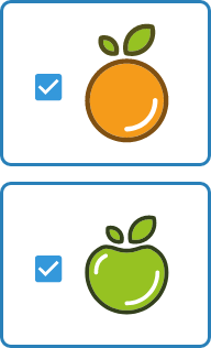
In this example we show how you can customize the characteristics of the CheckBoxes by class and by id so:
By Class: We customize common characteristics such as color, border.
By ID: We will dynamically modify the image, in our case we are storing the images in the devices.
When we use properties by class these are applied to all components defined as that class.
- border: The border consists of 2 parameters, the first is a numerical value in pixels, it represents the width of the border, and the second is the color that will be applied, for the colors we could use, hexadecimal values, color names, rgb,rgba, hsl or hsla.
- border-radius: We rounded the outline of our object, using px this time, but we could also use %.
.ClasCheckBox {
  border: 10px #2980b9;
  border-radius: 20px;
}
When we reference by ID, the changes are applied to each individual element that corresponds to the specified ID.
-
background-image: Allows you to change the image of the CheckBox, in this example we use images that are stored on the device (orange.png, apple.png), in this case the images must be stored in the assets directory, but you can also get images from a web server using the following notation
background-image: url(https://your-image.png).#checkBoxId1 { background-image: url(orange.png); } #checkBoxId2 { background-image: url(apple.png); }
RadioGroup
Example 1
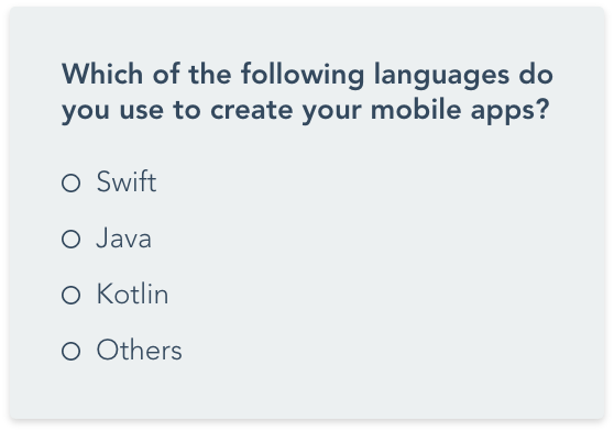
In this example we show the use of a RadioGroup, with the use of Radiobuttons and a TextView. We will customize the three components, as shown below:
- RadioGroup
- background-color: It allows us to change the background color of our component, in our example we see that we apply an hexadecimal color, but we can also get by color names, rgb, rgba, hsl or hsla.
- padding: To center the text, we use this property to give a space inside the component using px as parameter.
- border-radius: Allows you to put a rounded border on the GroupRadioButton, in this case we use px, but % could also be used.
RadioGroup { background-color: #ecf0f1; padding: 40px; border-radius: 10px; } - RadioButton
- color: Allows you to change the color of the Radio button text, in this case we use the name of the color, but the colors we could also use, hexadecimal values, rgb,rgba, hsl or hsla.
- font: Mcss allows you to apply fonts from google, simply by entering the name of the font you want to use.
- font-weight: To determine how bold or light your text will appear, We will use integer values.
- font-size: It allows us to change the font size, we can use px.
- text-transform: We can change the input format of the texts with the following parameters: lowercase, uppercase and capitalize.
RadioButton { color: #6a7a89; font: rubik; font-weight: 600; font-size: 70px; text-transform: capitalize; } - TextView
- color: Allows you to change the color of the Radio button text, in this case we use the name of the color, but for the colors we could use, hexadecimal values, rgb,rgba, hsl or hsla.
- padding: To get the text to look centered, we use this property to give a space inside the component using px as parameter.
- font: Mcss allows you to apply fonts from google, simply by entering the name of the font you want to use.
- font-size: It allows us to change the font size, we can use px.
label {
  color: #34495e;
  padding: 30px;
  font: Roboto;
  font-size: 80px;
}
Example 2
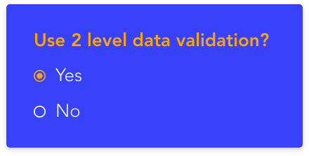
We will use Radiobuttons to make configurations within our apps, for this we will use the following components:
- RadioGroup
- background-color: It allows us to change the background color of our RadioGroup, in our case we will use a hexadecimal value, but colors by name, rgb, rgba, hsl or hsla are also allowed.
- padding: We apply padding throughout the interior of our RadioGroup, to obtain a better visual distribution of the content, we handle this parameter in px.
- border-radius: We round the outline of our object, using this time px, but we could also use %.
RadioGroup { background-color: #3742fa; padding: 40px; border-radius: 10px; } - RadioButton
- color: Allows you to change the color of the Radio button text, in this case we use the name of the color, but the colors we could use, hexadecimal values, rgb,rgba, hsl or hsla.
- font: Mcss allows you to apply fonts from Google, simply by entering the name of the font you want to use.
- font-weight: To determine how bold or light your text will appear, We will use integer values.
- font-size: It allows us to change the font size, we can use px.
- text-transform: We can change the input format of the texts with the following parameters: lowercase, uppercase and capitalize.
RadioButton { color: white; font: rubik; font-weight: 600; font-size: 70px; text-transform: capitalize; } - TextView
- color: Allows you to change the color of the Radio button text, in this case we use the name of the color, but for the colors we could use, hexadecimal values, rgb,rgba, hsl or hsla.
- padding: To center the text, we use this property to give a space inside the component using px as parameter.
- font: Mcss allows you to apply fonts from Google, simply by entering the name of the font you want to use.
- font-size: It allows us to change the font size, we can use px.
label {
  color: #FFa502;
  padding: 30px;
  font: Roboto;
  font-size: 80px;
}
RadioButton
Example 1
In this example we will show the customization of the radio button by id. Using this method, each component can be modified uniquely:
- font: Mcss allows you to apply fonts from google, simply by entering the name of the font you want to use.
- font-weight: Determine how bold or light your text will appear, We will use integer values.
- font-size: It allows us to change the font size, we can use px
- text-transform: We can change the input format of the texts with the following parameters: lowercase, uppercase and capitalize.
- color: Allows you to change the color of the Radio button text, in this case we use the name of the color, but for the colors we could use, hexadecimal values, rgb,rgba, hsl or hsla.
.radioYesNo {
  font: macondo-regular;
  font-weight: 900;
  font-size: 60px;
  color: red;
}

Example 2
We show you a very attractive alternative that can be applied.
- background-color: It allows us to change the background color of our RadioGroup, in our case we will use a hexadecimal value, but colors by name, rgb, rgba, hsl or hsla are also allowed.
- font: MCSS allows you to apply fonts from Google, simply by entering the name of the font you want to use.
- font-size: It allows us to change the font size, we can use px.
- font-weight: To determine how bold or light your text will appear, We will use integer values.
- border-radius: We round the outline of our object, using this time px, but we could also use %.
- color: Allows you to change the text color of the Radiobutton, in this case we use the name of the color, but for the colors we could use, hexadecimal values, rgb,rgba, hsl or hsla.
- text-transform: You can change the text of RadioButton in this case we are using Capitalice, other valid values are: lowercase, uppercase and capitalize.
.ClasRadio{
  background-color:#474787
  font: Roboto;;
  font-size: 60px;
  font-weight: 900;
  border-radius: 20px;
  color: white;
  text-transform: capitalize;
}

ToggleButton
Example 1
This example shows how we will customize the ToggleButton using several parameters that allow us to greatly modify its appearance.
- font: Allows you to change the font type of the Textview, applying Google Fonts.
- font-weight: To determine how bold or light your text will appear, We will use integer values.
- font-size: It allows us to change the font size, we can use px.
- background-color: It allows us to change the background color of our component, in our example we see that we apply an hexadecimal color, but we can also get by color names, rgb, rgba, hsl or hsla.
- color: Change the text color of the checkbox, for the colors we could use, hexadecimal values, color names, rgb,rgba, hsl or hsla.
- text-transform: You can change the text of the ToggleButton the valid values are:: lowercase, uppercase and capitalize.
- border-radius: We round the outline of our object, using this time px, but we could also use %.
ToggleButton {
  font: Lora;
  font-weight: 900;
  font-size: 60px;
  background-color: #FFC312;
  color: #2F3542;
  text-transform: uppercase;
  border-radius: 100%;
}

Example 2
We will create a button very similar to the web type button.
- background-color: It allows us to change the background color of our component, in our example we see that we apply an hexadecimal color, but we can also get by color names, rgb, rgba, hsl or hsla.
- color: Change the text color of the checkbox, for the colors we could use, hexadecimal values, color names, rgb,rgba, hsl or hsla.
- text-transform: You can change the text of the ToggleButton the valid values are: lowercase, uppercase and capitalize.
- border-radius: We round the outline of our object, using this time px, but we could also use %.
- font-weight: To determine how bold or light your text will appear, We will use integer values.
- font-size: It allows us to change the font size, we can use px.
ToggleButton {
  background-color: #CED6E0;
  color: #57606F;
  text-transform: lowercase;
  border-radius: 100%;
  font-weight: 900;
  font-size: 60px;
}

Example 3
We will create a very attractive and shiny button by modifying the following properties.
- background-color: It allows us to change the background color of our component, in our example we see that we apply an hexadecimal color, but we can also get by color names, rgb, rgba, hsl or hsla.
- color: Allows you to change the text color , in this case we use the hexadecimal, but for the colors we could use, color name, rgb,rgba, hsl or hsla.
- text-transform: You can change the text of the ToggleButton the valid values are:: lowercase, uppercase and capitalize.
- border-radius: We round the outline of our object, using this time px, but we could also use %.
- font: Allows you to change the font type of the ToggleButton, applying Google Fonts.
- font-size: It allows us to change the font size, we can use px.
- text-shadow: The text-shadow CSS property adds shadows to text. Each shadow is described by some combination of X and Y offsets from the element, and the last is the color, the colors we could use, color name, rgb,rgba, hsl or hsla.
ToggleButton {
  background-color: #A3CB38;
  color: #A3CB38;
  text-transform: uppercase;
  border-radius: 80%;
  font: lora;
  font-size: 80px;
  text-shadow: 2px 8px black;
}

Switch
Example 1
In this example we will show how to improve our switch using a few properties:
- background-color: It allows us to change the background color of our component, in our example we see that we apply an hexadecimal color, but we can also get by color names, rgb, rgba, hsl or hsla.
- thumb-color: Allows you to change the color of the selector, for the colors we could use, hexadecimal, color name, rgb,rgba, hsl or hsla.
- font: Allows you to change the font type of the Textview, applying Google Fonts.
- font-size: It allows us to change the font size, we can use px.
- font-weight: Determine how bold or light your text will appear, We will use integer values.
- content: This MCSS property allows you to modify the background color of the Switch outline.
- border-radius: We round the outline of our object, using this time px, but we could also use %.
- padding-left: Allows adding a padding-left with respect to the container.
Switch {
  background-color: #44BD32;
  thumb-color: #FFFFFF;
  font: lora;
  font-size: 60px;
  font-weight: 600;
  content: #ECF0F1;
  border-radius: 40px;
  padding-left: 50px;
}

LinearLayout
In this section we present several examples of Log in that you can use in your apps.
Example (Blue Login)
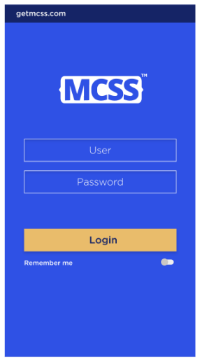
We will get an impressive start of session Blue, and we will see how MCSS allows us to obtain it, using the following components and modifying certain properties, let's start:
- linearLayout: LinearLayout will be useful to contain our components. We will create a component per class called linearEx and customize the following properties: background-color, padding-left, padding-right, padding-top.
- EditText: We will use two edittext, and we will create a class called edittextExI that allows us to modify the two components, the properties that we will customize are: color, background-color, text-transform, text-align, border-color, border-width, text-transform.
- Button: To log in to our application we use a button that we will also customize by modifying the following properties: text-align, text-transform, color, background-color, font-size, font-weight.
- Switch: We will use a switch to remind the user that he is logged into our application, and we will create a class called switchI, which we will use to modify the following properties: font-size, background-color, thumb-color, color.
- Statusbar: To maintain the harmony of colors also modify the color of the Statusbar, for that use the property: background.
- ActionBar: We will also modify the background color of the ActionBar, using this property: background.
.linearExI {
  background-color: #2F51E5;
  padding-left: 80px;
  padding-right: 80px;
  padding-top: 100px;
}
.edittextExI {
  color: white;
  background-color: #2F51E5;
  text-transform: uppercase;
  text-align: center;
  border-color: #FFFFFF;
  border-width: 5px;
  text-transform: capitalize;
}
.buttonExI {
  text-align: justify;
  text-transform: capitalize;
  color: navy;
  background-color: #E9BC6B;
  font-size: 80px;
  font-weight: bold;
}
.switchI {
  font-size: 70px;
  background-color: red;
  thumb-color: #CBC8C4;
  color: white;
}
Statusbar {
  background: #152466;
}
ActionBar {
  background: #152466;
}
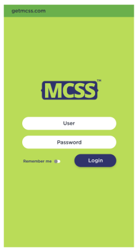
Example (Green & Blue Login)
We present a combination of green and blue colors, to create this striking login.
- LinearLayout: LinearLayout will be useful to contain our components. We will create a component per class called linearExII and customize the following properties: background-color, padding-left, padding-right, padding-top.
- EditText: We will use two edittext, and we will create a class called edittextExI that allows us to modify the two components, the properties that we will customize are: color, background-color, text-align, border-color, border-width, text-transform.
- Button: To log in to our application we use a button, which we will round its corners, to obtain a different design, which we will also customize by modifying the following properties.: text-align, text-transform, color, background-color, font-size, border-radius.
- Switch: We will use a Switch to remind the user that he is logged into our application, and we will create a class called switch2, we will use it to modify the following properties: font-size, Background-color, thumb-color, color.
- Statusbar: To maintain the harmony of colors also modify the color of the Statusbar, for that use the property: background.
- ActionBar: We will also modify the background color of the ActionBar, using this property: background.
.linearExII {
  background-color: #BADC58;
  padding-left: 80px;
  padding-right: 80px;
  padding-top: 100px;
}
.edittextExII {
  color: black;
  background-color: #FFFFFF;
  text-transform: uppercase;
  text-align: center;
  border-color: #FFFFFF;
  border-width: 5px;
  text-transform: capitalize;
  border-radius: 100px;
  }
.linearHExII {
  background-color: #BADC58;
  padding-top: 100px;
}
.buttonExII {
  text-align: justify;
  text-transform: capitalize;
  color: #FFFFFF;
  background-color: #30336B;
  font-size: 50px;
  border-radius: 100%;
}
.switch2 {
  font-size: 70px;
  background-color: red;
  thumb-color: #CBC8C4;
  color: #30336B;
  padding-top: 30px;
}
StatusBar {
  background: #6AB04C;
}
ActionBar {
  background: #6AB04C;
}
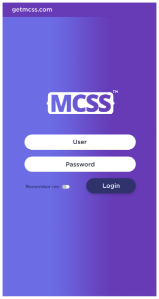
Example (Gradient Login)
We can create cool designs using gradients, in this example we will show you how to create them in a very simple way.
- LinearLayout: The first component we will use is a Linearayout and we will customize this component as follows: background-color, linear-gradient, padding-left, padding-right, padding-top.
- ImageView: We will scroll our image down using padding-top.
- EditText: We will use two edittexts for the username and password, and modify the layout using: color, background-color, text-align, text-transform, border-radius.
- LinearLayout: We'll use a second layout line that allows us to group the button and switch together, and we'll customize it as follows: padding-left, padding-right, padding-top.
- Switch: We will use a switch to make our app remember the user, and we will customize it using: font-size, background-color, thumb-color, color, padding-top, padding-left.
- Button: Finally we will use a button to enter our application, and we also customize them in the following way: text-align, text-align, text-transform, color, background-color, font-size, border-radius.
- StatusBar: We modify the StatusBar putting the following background.
- ActionBar: We modify the ActionBar putting the following background.
.linearEx1 {
  background-color: linear-gradient(90deg, #6c6ce5, #673ab6);
  padding-left: 80px;
  padding-right: 80px;
  padding-top: 100px;
}
ImageView {
  padding-top: 100px;
}
.edittextEx1 {
  color: black;
  background-color: #FFFFFF;
  text-align: center;
  text-transform: capitalize;
  border-radius: 100px;
}
.linearH {
  padding-top: 100px;
}

.switchV {
  font-size: 50px;
  background-color: red;
  thumb-color: #BCC2CC;
  color: #30336B;
  padding-top: 30px;
}
.buttonEx1 {
  text-align: justify;
  text-transform: capitalize;
  color: #FFFFFF;
  background-color: #30336B;
  font-size: 50px;
  border-radius: 100%;
}
StatusBar {
  background: #2B2D5C;
}
ActionBar {
  background: #2B2D5C;
}
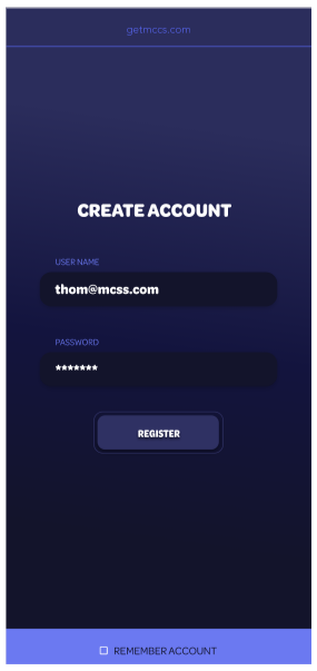
Example (Dark Blue Login)
In this case we will also use a gradient that allows us to obtain this spectacular deep blue, let's see how we get this contrast.
- LinearLayout: The first component we will use is a LinearLayout and we will customize this component as follows: background-color, linear-gradient, padding-left, padding-right, padding-top.
- EditText: We will use two edittexts for the username and password, and modify the layout using: color, background-color, text-align, text-transform, border-radius.
- TextView: It will be used to customize the text view to display the login title:color, text-align, font-size, font, text-transform, font-weight.
- TextView: We will use a textview defined as a class to modify the appearance of the username and password texts, and we will modify the following: color, text-transform.
- Button: Finally we will use a button to enter our application, and we also customize them in the following way: text-align, text-transform, color, background-color, font-size, border-radius, border-color, border-width.
- LinearLayout: Also use a LinearLayout to locate the footer of the application that will contain the switch element and we will modify the following properties: color, padding-left, padding-right, padding-top.
- CheckBox: We will use a CheckBox to remember the user data, and we will customize the following properties: background-color, padding-left, padding-right.
#linear2{
  background-color: linear-gradient(180deg, #2B2D5C, #13143E, #13142B);
  padding-left: 80px;
  padding-right: 80px;
  padding-top: 100px;
}
.edittext2 {
  color: #FFFFFF;
  background-color: #13142B;
  text-align: left;
  text-transform: capitalize;
  border-radius: 100px;
  font: Omnes SemiCond;
}
#textView2 {
  color: #FFFFFF;
  text-align: center;
  font-size: 90px;
  font: Omnes SemiCond;
  text-transform: uppercase;
  font-weight: 900;
}
.texviewN {
  color: #6A78F1;
  text-transform: uppercase;
}
#button2 {
  text-align: justify;
  text-transform: uppercase;
  color: #FFFFFF;
  background-color: #2F3163;
  font-size: 50px;
  border-radius: 40%;
  border-color: black;
  border-width: 5px;
}
#linear3 {
  color: #13142B;
}

#checkbox2 {
  background-color: #6B79F1;
}
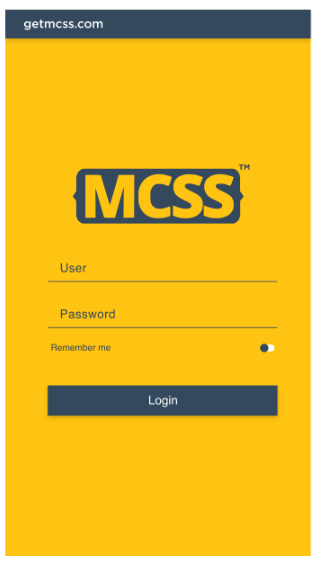
Example (Gold Login)
We present you this striking gold login, which can be obtained with few changes.
- LinearLayout: The first component we will use is a LinearLayout and we will customize this component as follows: background-color, padding, border.
- EditText: We used two edit texts for the username and password, and we will modify the design.using: color, text-transform, font, padding-left.
- Switch: A Switch is used to remember the user's username and password, and we will modify the following properties: background-color, thumb-color, color, text-transform, font.
- Button: In addition, a button is used that allows entering the system, the following properties were modified: color, background-color, text-transform, font, font-size.
- StatusBar: We modify the StatusBar putting the following: background.
- ActionBar: We modify the ActionBar putting the following: background.
#linearExV {
  background-color: #FFC312;
  padding: 100px;
  border: 40px;
}
.editTextUserV {
  color: #34495E;
  text-transform: capitalize;
  font: Helvetica;
  padding-left: 50px;
}
#switchV{
  background-color: white;
  thumb-color: #34495E;
  color: #34495E;
  text-transform: capitalize;
  font: Helvetica;
}
#buttonV {
  color: white;
  Background-color: #34495E;
  text-transform: capitalize;
  font: Helvetica;
  font-size: 60px;
}
StatusBar {
  background: #34495E;
}
ActionBar {
  background: #34495E;
}
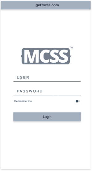
Example (White & Gray Login)
This simple but attractive design will be obtained by customizing the following properties of the components in our app.
- LinearLayout: We will make a few small changes to get the appearance shown in the LinearLayout and we will do it by customizing the following: background-color, padding.
- EditText: We will create a class to modify the appearance of our Edittext, which we use to enter the username and password, in this way: color, text-transform, font, padding-left.
- Switch: To remember the password and the user we will use a switch that we will customize as follows: background-color, thumb-color, color, text-transform, font.
- Button: To enter our app, we will use a button that we will customize as follows: color, background-color, text-transform, font.
- StatusBar: We modify the StatusBar putting the following: background.
- ActionBar: We modify the ActionBar putting the following: background.
#linearExVI {
  background-color: white;
  padding: 100px;
  border: 40px;
}
.editTextUserVI {
  color: #34495E;
  text-transform: uppercase;
  font: Helvetica;
  padding-left: 50px;
}
#switchVI {
  background-color: #D6D6D6;
  thumb-color: #34495E;
  color: #34495E;
  text-transform: capitalize;
  font: Helvetica;
}
#buttonVI {
  color: black;
  background-color: #A4B0BE;
  text-transform: capitalize;
  font: Helvetica;
  font-size: 60px;
}
StatusBar {
  background: #A4B0BE;
}
ActionBar{
  background: #A4B0BE;
}
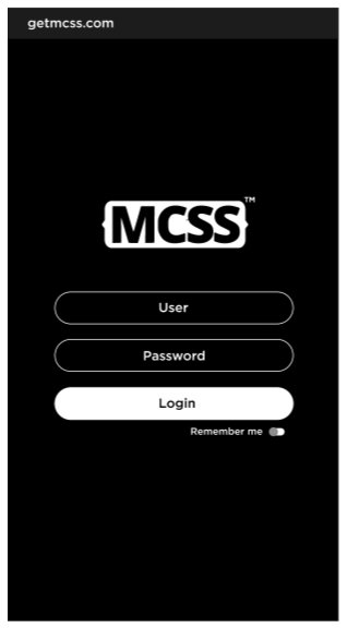
Example 8 (Dark Login)
With this impressive dark theme you will surely impress your users, we show you how to obtain it:
- LinearLayout: The first component that we will modify in the LinearLayout which is the one that contains all our objects, and we will modify its following properties:background-color, padding, border.
- EditText: We will use a class to modify the EditText, this allows us to reduce the use of code, we show you how: color, text-transform, text-transform, font, padding-left, background-color, border-width, border-color, border-width, border-radius, text-align.
- Switch: A Switch is used to remember the user's username and password, and we will modify the following properties: background-color, thumb-color, color, text-transform, font.
- Button: For the user to enter the system, we will use a custom button as follows: color, background-color, text-transform, font, font-size, border-radius.
- StatusBar: We modify the StatusBar putting the following: background.
- ActionBar: We modify the ActionBar putting the following: background.
#linearExVII {
  background-color: black;
  padding: 100px;
  border: 40px;
}
.editTextUserVII {
  color: white;
  text-transform: uppercase;
  font: Helvetica;
  padding-left: 50px;
  background-color: black;
  border-color: #FFFFFF;
  border-width: 5px;
  border-radius: 100%;
  text-align: center;
}
#switchVII {
  background-color: #D6D6D6;
  thumb-color: white;
  color: white;
  text-transform: capitalize;
  font: Helvetica;
}
#buttonVII {
  color: black;
  Background-color: white;
  text-transform: capitalize;
  font: Helvetica;
  font-size: 60px;
  border-radius: 100%;
}
StatusBar {
  background: rgb(28,28,28);
}
ActionBar {
  background: rgb(28,28,28);
}
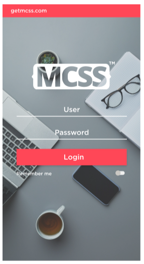
Example (Business Login)
In this example we will see how it is possible to use an image that is stored in our mobile device, as wallpaper of our app, for this example we will use an image that is stored in the drawable directory, let's see how this is done:
- LinearLayout: This time we will use an image found on our device in the folder assets, and we will reference it directly using these properties: background-image, padding.
- EditText: We will customize the edittext of our app as follows: color, text-transform, font.
- Switch: We use a switch to record our user data, we will customize it as follows: background-color, thumb-color, color, text-transform, font, padding-top.
- Button: We will use a button to enter our app, we will customize it as follows:color, background-color, text-transform, font, font-size.
- StatusBar: We modify the StatusBar putting the following: background.
- ActionBar: We modify the ActionBar putting the following: background.
#linearExVIII {
  background-image: url(image8.png);
  padding: 100px;
}
.editTextUserVIII {
  color: white;
  text-transform: capitalize;
  font: Helvetica;
  text-align: center;
}
#switchVIII {
  background-color: #D6D6D6;
  thumb-color: white;
  color: white;
  text-transform: capitalize;
  font: Helvetica;
  padding-top: 100px;
}
#buttonVIII {
  color: white;
  background-color: #FF4757;
  text-transform: capitalize;
  font: Helvetica;
  font-size: 60px;
}
StatusBar {
  background: #FF4757;
}
ActionBar {
  background: #FF4757;
}
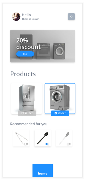
Example (Sales Gray)
On this occasion we present an example of an app for sales, in gray tones, let's see how to get this striking design.
- LinearLayout: The first component that we will use in this example is a LinearLayout that has the following properties customized: background-color, padding-left, padding-right, padding-top, border.
- ImageButton: In this example we will use an ImageButton and see how it can include MCSS Icons, and we will also modify the following properties: border-radius, background-color, color, icon-image.
- ImageView: We will dynamically load our logo and customize it as follows: padding-top, border-radius, background-image.
- LinearLayout: We can also dynamically assign images to our LinearLayout, and we will also customize it like this: padding-left, padding-left, padding-right, padding-top, background-image.
- Button: We will customize the sell button, as follows: border-radius, background-color, color, text-transform.
- TextView: To show our discount we will use a class, which allows us to modify two TextView with the same code. Let's see how we achieve this by modifying the following properties: color, font-weight, font-size, padding-left, font.
- TextView: We need to scroll our textview field containing the discount percentage, for this we will use a selector by ID and we will modify only the following property: padding-top.
- TextView: To put the title of our products we will use a selector by Id, since this title is different, and we customize it in the following way: font-weight, font-size, color, font, padding.
- LinearLayout: To present the images of the products that are displayed in our app we use LinearLayout, we will use a class to customize the images by modifying the following common properties: border-radius, padding-left, padding-right.
- LinearLayout: We use LinearLayout to assign images of our products, we will parameterize this product as follows:border, Background-image.
- LinearLayout: We use LinearLayout to assign images of our products, we will parameterize this product as follows:border, Background-image.
- CheckBox: We will use CheckBox, so that our users select the product of their choice and we will customize the following properties: font-weight, font-size, background-color, border-radius.
- CheckBox: We will use CheckBox, so that our users select the product of their choice and we will customize the following properties: font-weight, font-size, background-color, border-radius.
- TextView: A TextView is used to identify the recommended products for the user who visits us, changing the following properties: font-weight, font-size, color, font, padding-top.
- LinearLayout: For our recommended products we will create a class that allows us to standardize this section in this way: border, padding-left.
- LinearLayout: For each of the images we will use a LinearLayout, and we will modify only the image, changing the following property: background-image.
- Button: We will use a button to return to the home of our application and we will customize it as follows: padding-top, background, text-transform, color.
#linearSales {
  background-color: white;
  border: 40px;
}
#buttonConfig {
  border-radius: 50%;
  background-color: silver;
  color: #FFC312;
  icon-image: mcss-icon('setting.light', 6x, white);
}
#imageViewLogo {
  border-radius: 100%;
  background-image: url(grupo.png);
}
#linearMaquinas {
  background-image: url(maquinas.png);
}
#buttonBuy {
  border-radius: 100%;
  background-color: #1E90FF;
  color: white;
  text-transform: capitalice;
}
.classDiscount {
  color: white;
  font-weight: 700;
  font-size: 80px;
  padding-left: 30px;
  font: Open Sans;
}
#textViewPor {
  padding-top: 100px;
}
#textViewProducts {
  font-weight: 900;
  font-size: 120px;
  color: #747D8C;
  font: Open Sans;
  padding-top: 100px;
}
.classProd{
  border-radius: 15px;
  padding-left: 70px;
  padding-right: 70px;
}
#linearProd1 {
  border: 6px #BEBEBE;
  background-image: url(washing_machine.png);
}
#linearProd2 {
  border: 6px #1E90FF;
  background-image: url(fridge_freezer_side.png);
}
#checkBoxP1 {
  font-weight: 600;
  font-size: 60px;
  background-color: #BEBEBE;
  border-radius: 50%;
}
#checkBoxP2 {
  color: white;
  font-weight: 600;
  font-size: 60px;
  background-color: #1E90FF;
  border-radius: 50%;
}
#textViewRecommended {
  font-weight: 900;
  font-size: 80px;
  color: #747D8C;
  font: Open Sans;
  padding-top: 100px;
}
.classRecom {
  border: 6px #00000029;
  padding-left: 100px;
}
#linearIm1 {
  background-image: url(serving_kitchen.png);
}
#linearIm2 {
  background-image: url(plastic_kitchen.png);
}
#linearIm3 {
  background-image: url(black_plastic_kitchen.png);
}
#buttonHome {
  padding-top: 100px;
  background-color: #1E90FF;
  text-transform: lowercase;
  color: white;
}
MCSS Icons
MCSS Icons is a complete set of icons that can be included in the development of our app, each icon can be changed in size, color, and appearance, let's explore some examples.
Example ImageButton Icon 1X
For our first example we are going to show how an icon is used from Mcss Icons, and we will use an ImageButton and we will modify it as follows:
- ImageButton: For our first example we will use an ImageButton, and we will use a size of 1x, we will also modify the following properties: border-radius, background-color, color, icon-image, mcss-icon.
ImageButton {
  border-radius: 40%;
  background-color: #302754;
  color: #FFC312;
  icon-image: mcss-icon('chevron.double.down', 1x, #FFC312);
}
Example ImageButton Icon 7X
In this example we will show an icon at 7x size, icons can take a size from 1x to 7x:
- ImageButton: We use the same style applied in example 1, and we only change the size of our icon, this shows that the Mcss Icons change their size depending on the need and customize the following properties: border-radius, background-color, color, icon-image, mcss-icon.
ImageButton {
  border-radius: 40%;
  background-color: #302754;
  color: #FFC312;
  icon-image: mcss-icon('chevron.double.down', 7x, #FFC312);
}
Example Button Icon 7x
We can also use MCSS icons on our buttons, the image will appear on the left side of our button, let's see how to do this:
- Button: We will modify the following properties to obtain this striking design: background-color, font-size, color, text-transform, border-radius, icon-image, mcss-icon.
Button {
  background-color: #5352ED;
  font-size: 60px;
  color: #FFFFFF;
  text-transform: capitalize;
  border-radius: 80%;
  icon-image: mcss-icon('download.light', 7x, #FFFFFF);
}
Example Button Icon 6X
We present this button with a gold and blue combination, with a Home icon with a size of 6x:
- Button: We will customize our button as follows: background-color, color, text-transform, border-radius, font-weight, icon-image, mcss-icon.
Button {
  background-color: #FFC312;
  color: #2F3542;
  text-transform: capitalize;
  border-radius: 50%;
  font-weight: 900;
  icon-image: mcss-icon('home.solid', 6x, #2F3542);
}
Example Button Icon 5X
We show an example of a control for play using a striking color in green and white:
- Button: We will customize our button as follows: background-color, color, text-transform, border-radius, font-weight, icon-image, mcss-icon.
Button {
  background-color: #A3CB38;
  color: #FFFFFF;
  text-transform: capitalize;
  border-radius: 100%;
  font-weight: 900;
  icon-image: mcss-icon('play.solid', 5x, #FFFFFF);
}
Example Button Icon With Pixel
MCSS icons allow you to change the size using pixels, let's see how we can define our sizes:
- Button: We will customize our button using the following background-color, color, text-transform, border-radius, icon-image, mcss-icon.
Button {
  background-color: #7f8fa6;
  color: #FFFFFF;
  text-transform: capitalize;
  border-radius: 100%;
  icon-image: mcss-icon('file.edit.light', 210px, #FFFFFF);
  font-weight: 900;
}
