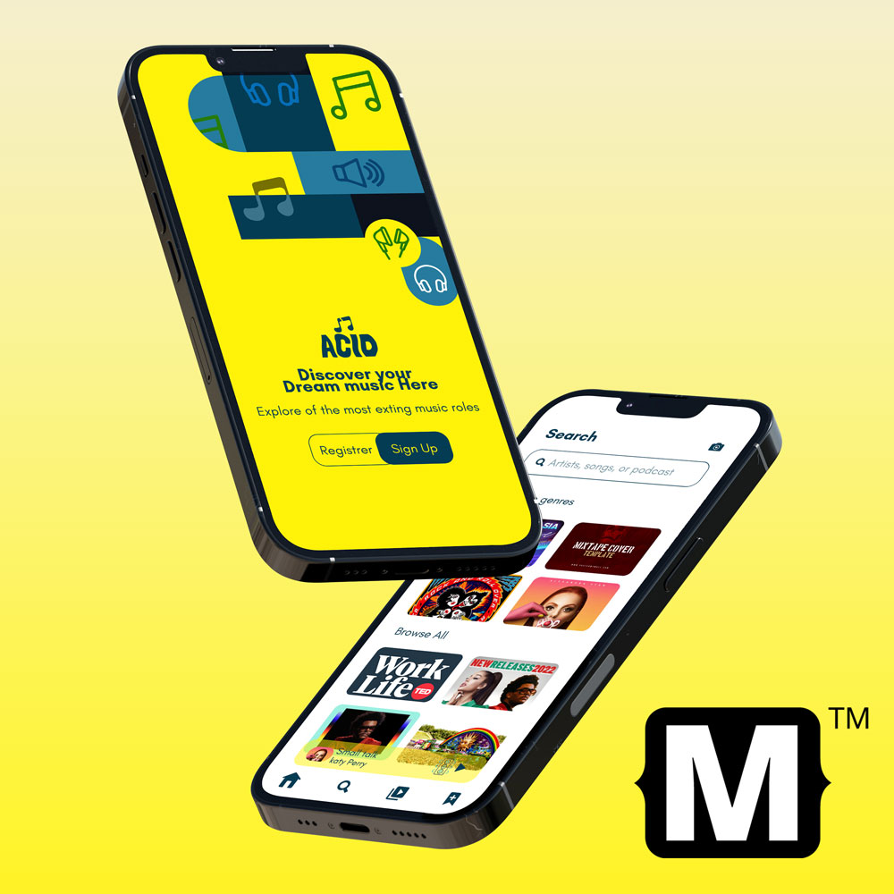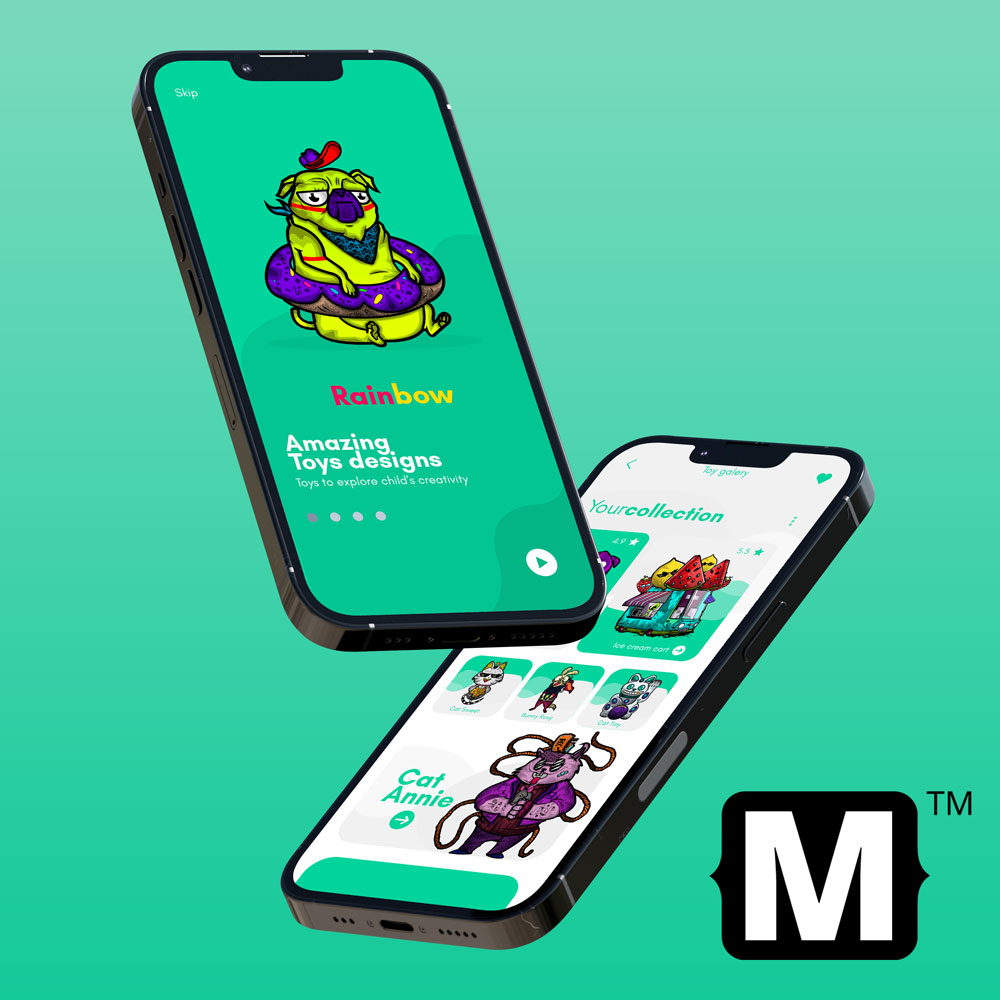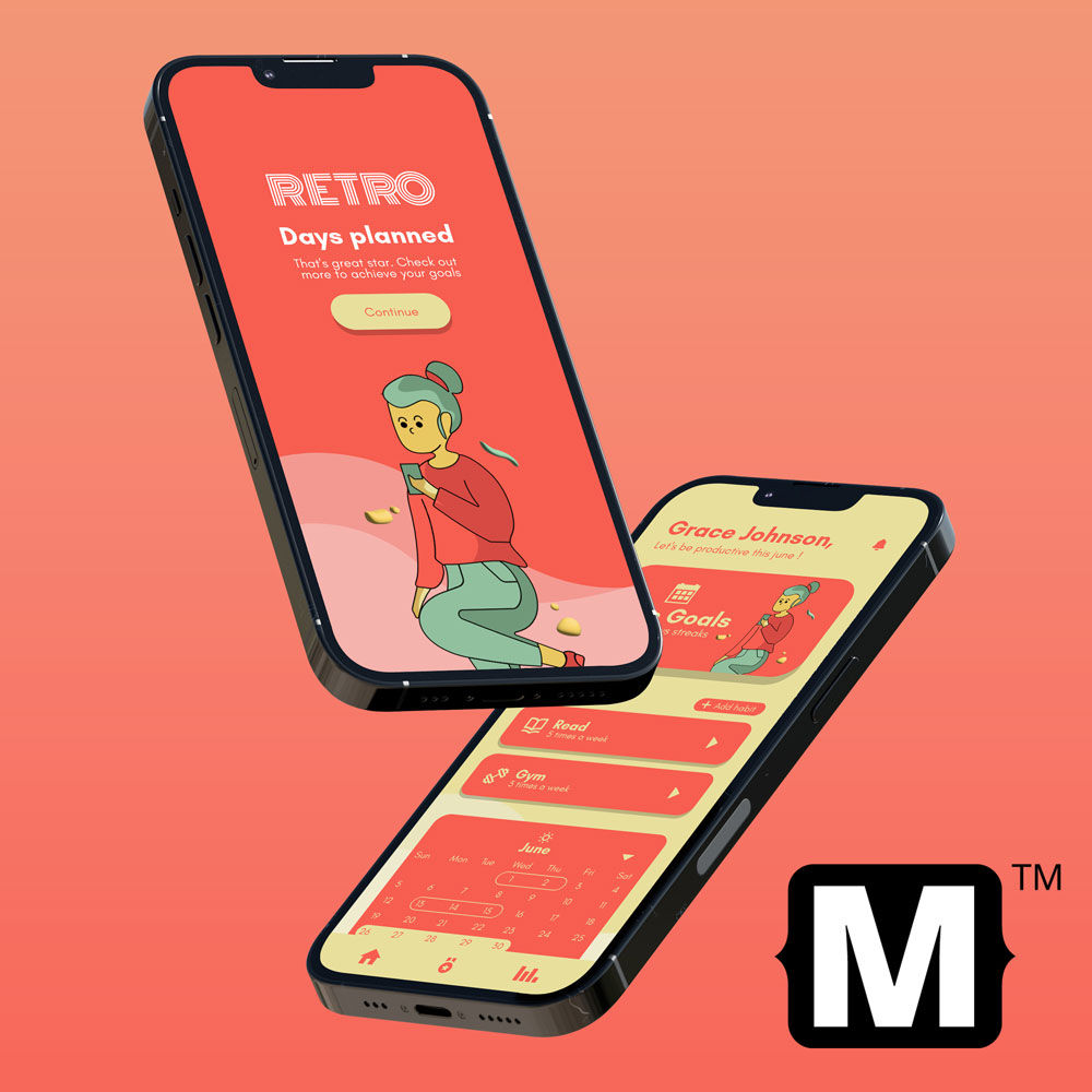

Acid
Bright colors and elements with little vertex that try to convey order and solidity. A rough and bright style perfect for youthful designs.


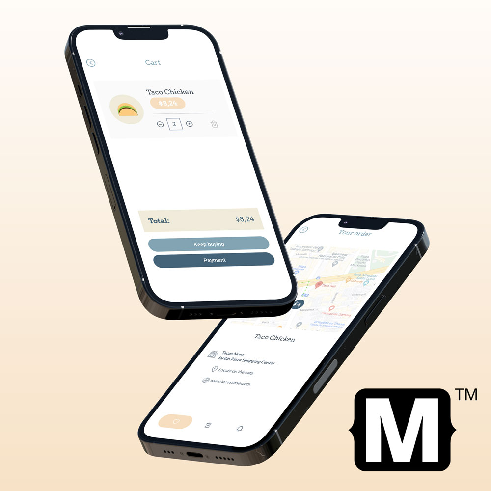
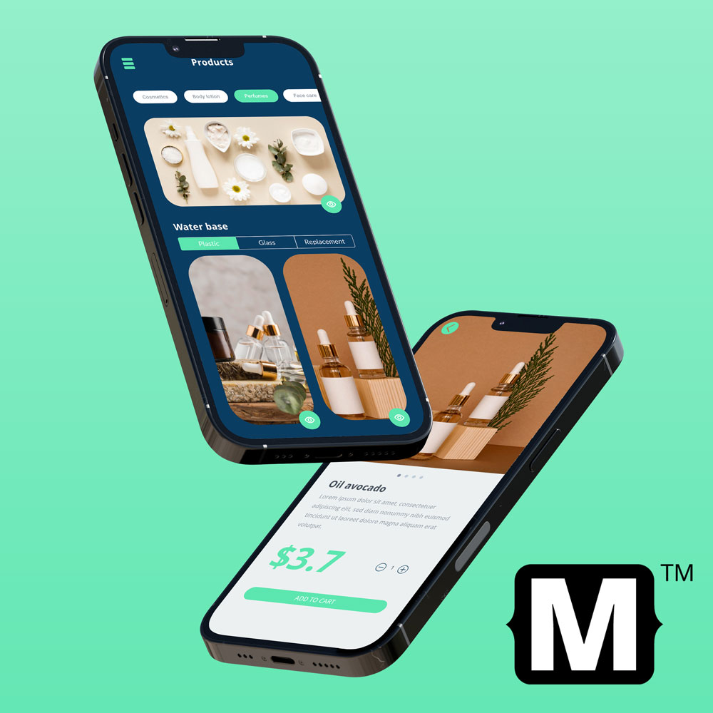
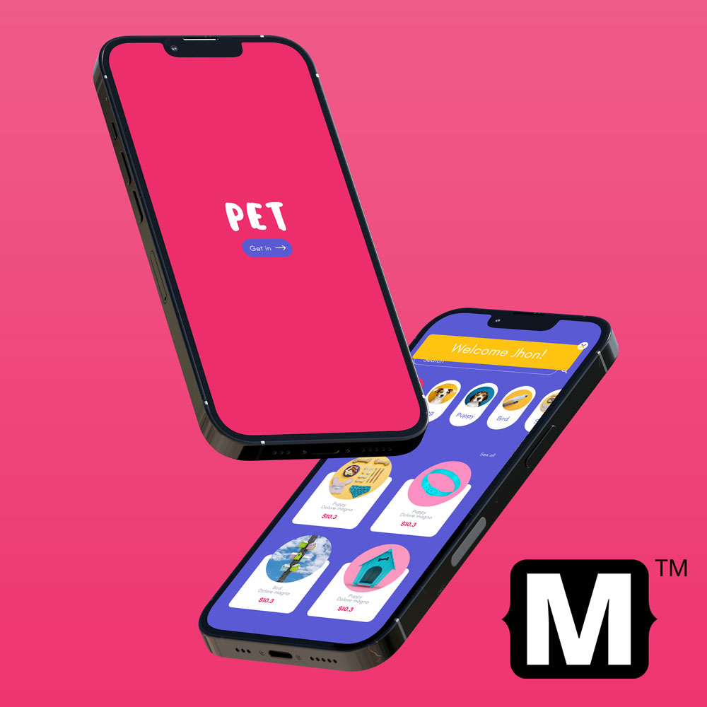
MCSS Offers you a list of themes designed to edit the appearance of every app component like buttons, switches, labels etc.
For a better experience, you can add some classes to your componentes and they will adopt different appearances. For example you can set a button as primary or secondary, or choose a normal or light background for a popup.
If you prefer, you can set a personal stylesheet to your project in addition to the chosen theme, in that new file, you can adapt the appearance to your full needs (how to add .mcss files to your project)
To select a theme you can use the function: useTheme:named indicating the name of the desired theme (Read more about the MCSS Implementation)
MCSS.shared.useTheme(named: "moon")
In the specification of each theme you will obtain more information about the theme features and the classes that you can use in your components.